Editorial & Layout Design
This section contains print and digital editorial design. There are many elements of design in each of these such as typography and illustration that I carefully considered to create a thoughtful and communicative piece.
I have worked over 8 years on A&W Restaurants, and every year created 4 seasonal sales events that contain around ~40 pieces of print collateral. It’s been a shit ton of work! These pieces below are a few of my favorites. Each one, I worked with my team to conceptualize and execute. I hand painted and scanned in some of this typography. The photography for each one, I directed, and the illustrations I drew! If you’d like to learn more about the process for this section, please don’t hesitate to reach out!
A&W Restaurants
fun fact: i used wadded up paper towels to form chicken tender-like structures, which helped me sketch out the optimal chicken tender pile for the food stylist to reference.
The flame on this was created by a cardboard cut out of a flame shape, and photographing it's shadow. Practical effects are still great, y'all.
Hand painted and scanned in. It takes time, but the texture is way better than digital recreation.
I love the groovy apple illustrations and cute lockup I created for this one!
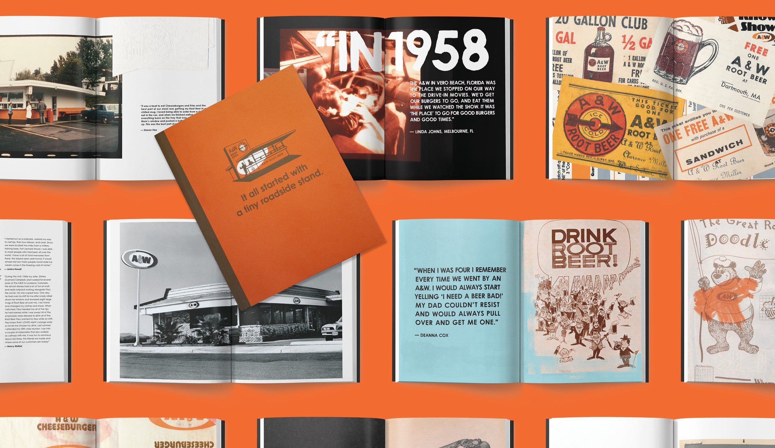
Along with my CD, I created this amazing coffee table book for the 100th anniversary of A&W Restaurants. I laid out tons of quotes, photos, hand painted elements and illustrations. I combed through A&W's archives and compiled original ads, photos, and more in a thoughtful way to tell the story of A&W.
This is one of my favorite patterns and lockups i've ever made!
One of my all time favorite illustrated posters. I was heavily influenced by Peter Max.


