Branding & Identity
I enjoy seeing all the pieces of the puzzle come together for a brand. It’s not just getting to decide fonts and colors, but making sure that while it all looks nice on paper, it truly does look nice printed on paper! below are examples of branding I personally developed or worked with my creative team to develop.
Martin Luther King Jr. Committee
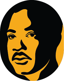
I’ve worked with the MLK Celebration Committee for around 7 years, usually providing print media and illustration. For their 50th year however, they decided they needed a rebrand that would consolidate their media and how they looked as an organisation. The fonts, colors, and logo were all designed to represent strength and resilience. Each year i’ve created a portrait of Dr. King, and the one below is by far my favorite!
Soulfeast mini branding
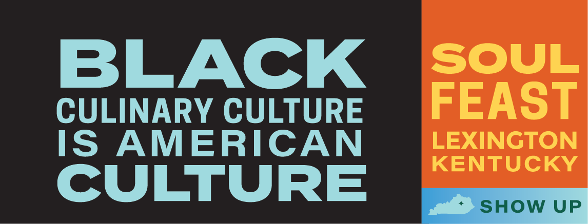
Soulfeast is an annual festival here in Lexington, Kentucky that celebrates Lexington Black Restaurant Week. The organization needed a way to really show who they were and stand-out in the community to get the word out. My favorite element I created is the patterns. Quilting has been a medium for storytelling for centuries, and they’re also deeply comforting. This deeper connection felt perfect!


Thomas S. Moore Bourbon
My team and I launched the new Thomas S. Moore Bourbon for Sazerac. I spearheaded a significant portion of the package design and branding efforts, ensuring that the product would not only delight the palate but also captivate consumers with an astutely crafted visual identity. Our collaborative efforts resulted in a bourbon that conveyed sophistication and excellence. For more packaging examples, head over to the Honorable Mentions section!


